From today, I’m working on a very large diagram with hundreds of nodes and connectors that represent part of our business strategy. I’m doing some reorganizing at the top level of the diagram, and this involves stepping through each of the Company Goals and checking to make sure the incoming connections are correct. Lots of left-right scrolling to follow lines! And because there are so many, once I finished dealing with one Company Goal, I could pull that goal out of my group and re-hoist to focus. Doing this straightens out the lines, but it makes it only marginally easier to follow the lines in the group. It’s still messy and difficult to follow.
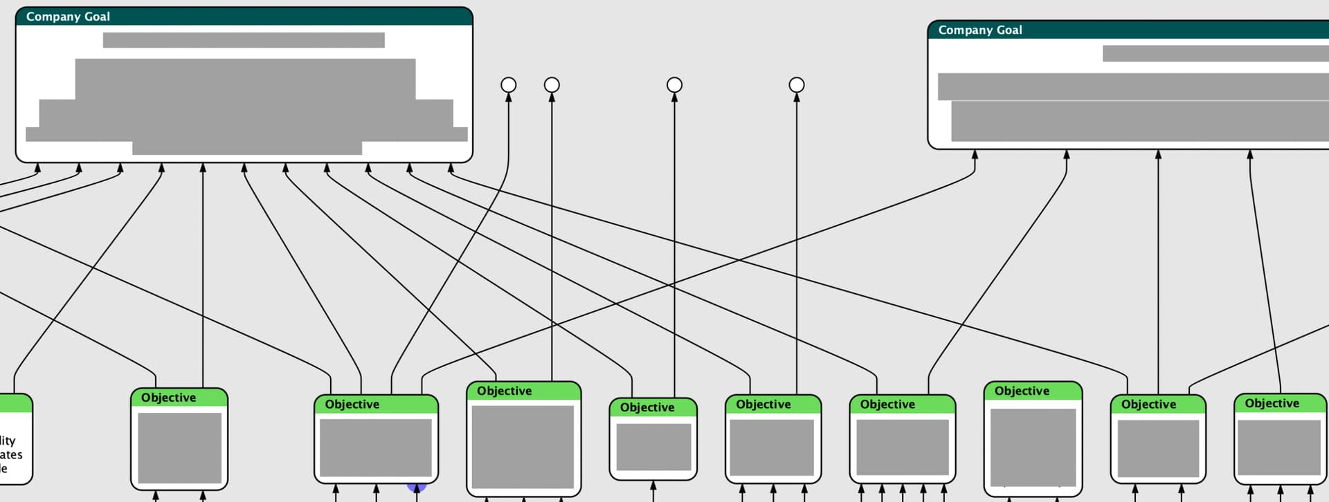
(Please forgive the redactions; to show the diagram I have to cover this content.)
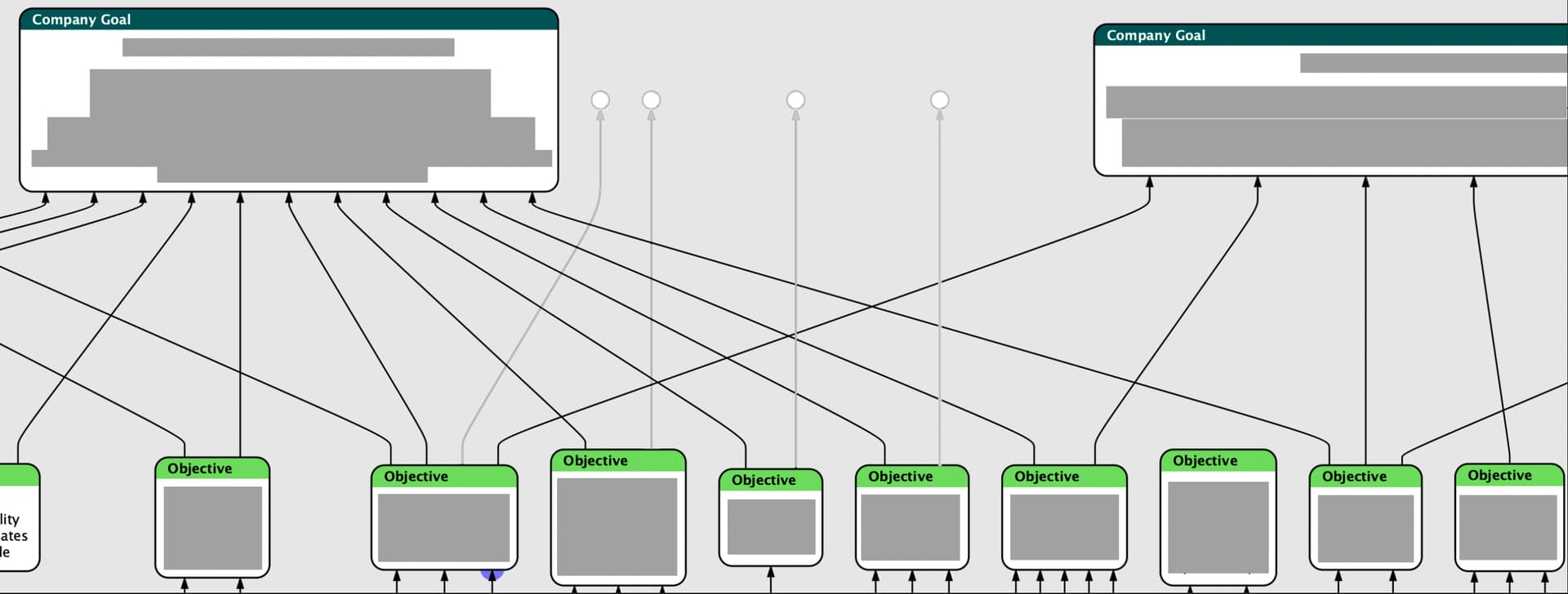
What I’d love is an option (or default, since I can’t think of a use case where I wouldn’t want this) to dim the connectors that leave the hoisted group. I had to pick a space that wouldn’t be terribly time-consuming to mockup but that would still convey how in the many worse areas of the diagram this would be tremendously helpful. Here’s my mockup:
Zooming out, here’s one of the messier areas. And this is enforcing a lot of hierarchy to my information already. There’s just this much going on.

(Yikes)
I don’t at all mind creating, nesting, and hoisting groups to make the process easier, because it’s a methodical process that works for me. But I need more help from the visualization.